#The P.S. line: cold email micro-copy that lifts replies
Copy page
TL;DR: A well-written P.S. line gets read even when the body of the email gets skimmed, which makes it one of the highest-leverage two lines in a cold email. Pair it with a clean signature and a compliant footer, and the bottom of the email does real work instead of sitting there as an afterthought.
#Table of contents
- Why the P.S. line gets read
- What makes a good P.S. line
- P.S. formulas that work
- P.S. lines by industry and deal type
- Signature design for cold email
- Mobile rendering and why it matters more than desktop
- Footer rules and deliverability
- Mistakes that waste the bottom of the email
- Testing the P.S. line
- How AI-assisted drafting should handle micro-copy
- FAQs
#Why the P.S. line gets read
Readers skim.
They scan the first line, jump to the CTA, and often glance at whatever sits right before the sign-off.
That last glance is the P.S. line, and it survives the skim in a way that paragraph three never does.
This is not unique to email.
Direct mail copywriters noticed the same pattern decades before cold email existed: the P.S. is one of the most-read parts of any letter, second only to the headline and the opening line.
Cold email inherited that behavior because reading patterns did not change when the medium did.
A reader who has already decided the email is not urgent enough to read fully will often still glance at the P.S. out of habit, curiosity, or simple eye movement toward the bottom of the screen.
That makes the P.S. line one of the few places in a short email where you get a second chance to land the point, after the reader has already mentally filed the message as "skip."
There is a second reason it works, separate from reading habits.
A P.S. line breaks the expected structure of a formal email.
Most business correspondence ends cleanly at the sign-off, so a line that appears after it reads as an afterthought, a genuine second thought the sender wanted to add.
That structural break signals authenticity in a way the body of the email, however well written, cannot.
It is one of the few remaining places in a cold email where format itself does persuasive work, independent of the words used inside it.
Average cold email reply rates sit around 3.4%, with strong, well-targeted segments reaching 10-20%.
The gap between those numbers rarely comes down to one big lever.
It comes down to a series of small ones, and the P.S. line is one of the cheapest to get right.
#What makes a good P.S. line
A good P.S. line does one of four things, and rarely more than one at a time.
It adds a second, lower-commitment ask. If the main CTA asks for 15 minutes, the P.S. might offer a one-line async reply option instead: "P.S. If a call's not the right fit, happy to just send over the two-minute summary."
It surfaces a proof point. A specific result, kept short, works well here because the reader's guard is slightly lower by the time they reach the bottom of the email.
It adds a human, personal touch. A genuine, specific detail (not generic small talk) reminds the reader a person wrote this, not a template.
It creates gentle urgency without pressure. A real deadline or limited availability, stated plainly, without manufactured scarcity.
What a good P.S. line never does is repeat the main CTA word for word.
If the body already asked for 15 minutes and the P.S. asks for 15 minutes again in different words, it reads as redundant rather than reinforcing.
#P.S. formulas that work
 P.S. formulas that work
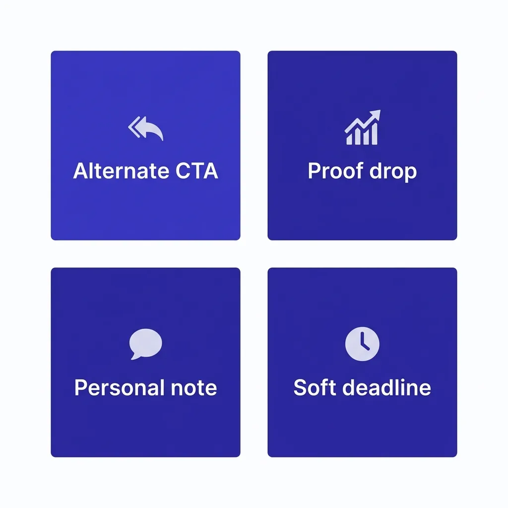
Four formats show up repeatedly in emails that convert.
The alternate CTA. "P.S. If email's easier than a call, just reply here and I'll send the short version." This respects that not every reader wants a meeting as the first step.
The proof drop. "P.S. The team I mentioned went from 8% to 34% show rate in six weeks, happy to share exactly how." Short, specific, and gives the reader a reason to reply even if they skipped the body.
The personal note. "P.S. Saw your post about [specific, real detail] last week, good read." This only works when the detail is real and specific. A vague version ("Loved your recent content!") reads as scripted immediately.
The soft deadline. "P.S. We're wrapping up this cohort by [date], so if timing's off, no worries, just let me know and I'll follow up later." Stating a real constraint plainly, with an easy out, respects the reader instead of pressuring them.
Pick one formula per email.
Stacking a proof drop, a deadline, and an alternate CTA into one P.S. line turns two lines into a paragraph, which defeats the entire purpose of the format.
Look at two weak-to-strong transformations to see the difference in practice.
Weak: "P.S. Let me know your thoughts!"
Strong: "P.S. If it's easier, just reply 'yes' and I'll send over times, no need to write anything else."
Weak: "P.S. We're a great fit for teams like yours."
Strong: "P.S. A team your size cut list-cleaning time from 3 hours a week to 20 minutes after automating verification."
The weak versions are filler.
They could sit at the bottom of any email from any sender.
The strong versions do a specific job: lower the effort required to reply, or give one more concrete reason to care.
#P.S. lines by industry and deal type
The right P.S. format shifts depending on who is reading it and how big the decision is.
High-volume, low-complexity sales (SMB, self-serve-adjacent). A low-friction alternate CTA works best here, since the goal is reducing any remaining friction to a fast yes. "P.S. Reply 'send it' and I'll skip the call and just send the trial link."
Mid-market, multi-stakeholder deals. A proof point framed around a peer company tends to perform well, since the reader is often gathering evidence to share internally. "P.S. Happy to send the one-pager our other [industry] clients use to get buy-in from their team."
Enterprise and long-cycle sales. A soft deadline or a light personal note works better than a hard proof point, since enterprise buyers are wary of anything that feels like pressure this early. "P.S. No rush at all, just flagging we're planning our next onboarding cohort for [month] if timing lines up."
Recruiting outreach. A personal, specific note about the candidate's actual work performs far better than a proof point about the company, since the reader is being courted as an individual, not a business. "P.S. That talk you gave on [specific topic] last month was sharp, particularly the part about [detail]."
Founder-to-founder or investor outreach. Brevity and directness matter more than warmth. "P.S. If now's genuinely not the time, a one-line 'not now' is more useful to me than silence."
Across all five, the pattern holds: match the P.S. format to what that specific reader is actually weighing when they decide whether to reply.
This matching effort pays off disproportionately for two lines of copy.
A generic P.S. costs nothing extra to write, but it also does nothing extra for reply rate.
A matched one takes an extra thirty seconds of thought and consistently earns a measurable lift, which makes it one of the highest-return edits available anywhere in a cold email sequence.
#Signature design for cold email
The signature block does more identity-verification work than most senders realize.
A reader deciding whether an email is legitimate scans the signature almost as fast as they scan the P.S., often looking for a real name, a real title, and some sign the sender is a person, not a mass-sending system.
Keep four things in the signature: full name, title, company name, and one way to verify you (a company URL or LinkedIn link is enough).
Cut everything else.
A signature stacked with a logo image, three social icons, a company tagline, a legal disclaimer, and a calendar booking button does two things wrong at once.
It slows down mobile rendering, since heavy image-based signatures often break or load oddly on mobile clients, and it visually competes with the actual message for attention.
| Signature element | Keep it | Cut it |
|---|---|---|
| ✓ Full name | Yes, always | |
| ✓ Title and company | Yes, builds legitimacy | |
| ✓ One verification link | Yes, LinkedIn or company site | |
| ✗ Embedded logo image | Often breaks rendering, adds weight | |
| ✗ Multiple social icons | Visual clutter, rarely clicked in cold outreach | |
| ✗ Company tagline or slogan | Reads as marketing, not a person | |
| ✗ Calendar booking button as an image | Better as a plain text link if used at all | |
| ✗ Legal disclaimer paragraph | Belongs in the footer, not the signature |
A plain-text signature with a real name, real title, and one clean link almost always outperforms a designed one in cold outreach specifically, even though a designed signature might look better in a warm, ongoing relationship email.
The context is different, and the format should follow the context.
#Mobile rendering and why it matters more than desktop
Most cold email gets opened on a phone first, even in B2B contexts where the final decision happens on a desktop.
That single fact changes how the bottom of the email should be built.
An image-heavy signature that looks fine on a wide desktop client can collapse awkwardly on a narrow mobile screen, sometimes pushing the actual message content further down or breaking the layout entirely.
A long P.S. line that wraps to four lines on mobile loses the punchy, skimmable quality that made it worth including in the first place.
Test every template, including the P.S., signature, and footer, on an actual phone screen before sending to a full list, not just in a desktop preview pane.
A few things to check specifically: does the signature still show a real name without scrolling, does the unsubscribe link stay visible without excessive scrolling, and does the P.S. line still read as one clean thought at mobile width.
Small formatting choices, like avoiding forced line breaks and keeping the P.S. to a single sentence, hold up better across device sizes than anything requiring precise visual alignment.
The safest default is the simplest one: plain text, short lines, minimal formatting at the bottom of the email.
Simplicity also protects deliverability indirectly.
Heavy HTML signatures and image-based footers increase the chance of rendering glitches that make an email look broken, and a broken-looking email gets deleted or reported at a higher rate than a clean, plain one, regardless of how strong the copy underneath it is.
#Footer rules and deliverability
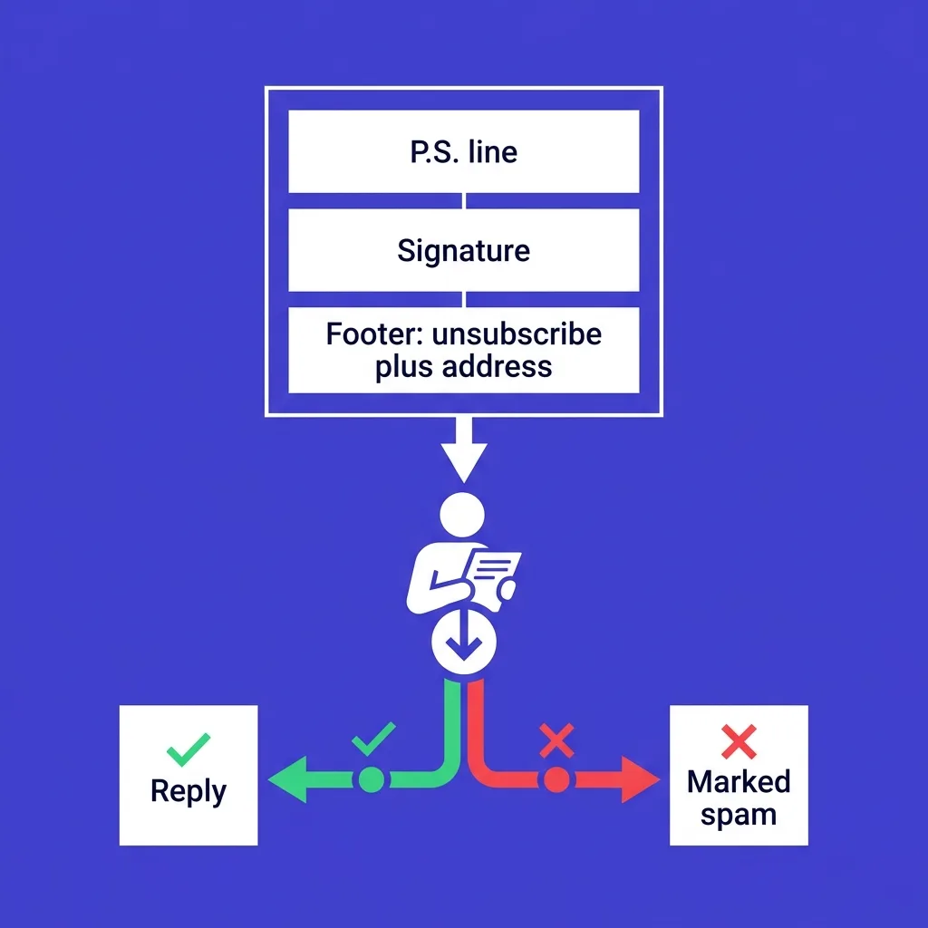 Footer rules and deliverability
The footer is not decoration.
It carries real compliance weight, and getting it wrong affects deliverability, not just aesthetics.
Every commercial email needs a working unsubscribe mechanism, and as of the current bulk sender rules enforced by Google, Yahoo, and Microsoft, a one-click unsubscribe header is required for bulk senders, not just a polite suggestion.
Skipping or hiding this does not just risk compliance penalties.
It directly damages your complaint rate, because a reader who cannot find an easy way to opt out is more likely to hit "report spam" instead, and that single action does far more damage to your sender reputation than an unsubscribe click ever would.
Keep the footer to three things: an unsubscribe link, a physical mailing address (required for CAN-SPAM and similar regulations in other regions), and, if relevant, a one-line reason the recipient is receiving the email.
Avoid stuffing the footer with multiple tracking links, secondary CTAs, or a wall of legal text that pushes the actual unsubscribe link below the fold of a mobile screen.
A cluttered footer with five links looks more like a marketing blast than a personal email, and inbox providers score exactly that kind of pattern when deciding placement.
Every element at the bottom of the email either builds trust or erodes it. There is no neutral option once a reader's eyes land there.
#Mistakes that waste the bottom of the email
A P.S. that just repeats the CTA. "P.S. Let me know if you want to chat!" adds nothing the body did not already say.
A signature stuffed with images and icons. Heavier signatures slow rendering and look more like a marketing template than a person.
A footer buried under legal text. If the unsubscribe link requires scrolling past three paragraphs of disclaimer, most readers will report the email instead of finding it.
Fake urgency in the P.S. "P.S. Only 2 spots left!" in a cold B2B email to a stranger reads as manufactured, especially when the same line appears in every email in the sequence.
Generic personal notes. "P.S. Hope you're having a great week!" is not personal. It is filler dressed up as warmth, and readers can tell the difference immediately.
No P.S. at all. Leaving the bottom of the email blank wastes one of the highest-attention two lines available in the entire message.
Mismatched tone between the body and the P.S. A formal, buttoned-up body followed by an overly casual P.S. can feel jarring rather than warm. Keep the register consistent even when the P.S. adds a lighter touch.
A P.S. that contradicts the body. If the body says "no pressure, take your time" and the P.S. adds a hard deadline, the two signals cancel each other out and the reader notices the inconsistency.
Using the P.S. as a dumping ground for an idea that didn't fit elsewhere. If a point matters enough to include, it deserves a proper place in the body, not a rushed afterthought tacked onto the end.
Most of these mistakes come from treating the bottom of the email as low-stakes real estate.
Given how consistently it gets read, it deserves the same editing attention as the subject line.
#Testing the P.S. line
Most teams test subject lines and CTAs and skip the P.S. entirely, which leaves an easy lift on the table.
Run a simple test: send the same email with a P.S. against the same email with no P.S., holding everything else constant.
Across a large enough send volume, the version with a well-written P.S. line typically shows a measurable lift in reply rate, since it gives skimmers one more concrete reason to engage even after deciding to skip the body.
Once you confirm a P.S. helps, test formats against each other: proof drop against alternate CTA, for instance.
Track which format drives replies that actually convert to booked meetings, not just replies in general, since a P.S. that generates polite but noncommittal replies is doing less real work than one that moves the conversation forward.
Rotate in fresh proof points and personal details regularly.
A P.S. line that reused the same statistic for six months starts to feel as stale as any other part of a sequence that never gets refreshed, and readers who receive multiple touches from you over time will notice the repetition faster than you expect.
Run the test cleanly by isolating one variable at a time.
Keep the subject line, body, and send time identical across both cells, and change only the P.S. line.
Split the list randomly into two equal groups so neither cell skews toward a more responsive segment by accident.
Send at least 200 emails per cell before drawing a conclusion, since smaller samples produce swings that look meaningful but are really just noise.
Once a winner emerges, do not stop testing.
Pit the winning format against a new challenger, the same way you would keep testing subject lines even after finding one that performs well, since audience behavior shifts over time and a format that worked six months ago can quietly stop working without anyone noticing until the numbers are checked.
#How AI-assisted drafting should handle micro-copy
AI drafting tools are good at generating a P.S. line fast.
They are not automatically good at generating one that avoids the generic-filler trap, since "P.S. Let me know if you have any questions!" is exactly the kind of safe, low-risk output a model defaults to without more specific instruction.
The fix is not avoiding AI for this part of the email.
It is making sure a real person reviews the micro-copy, the same way they would review the subject line or the CTA, before the email sends.
This is one area where a human-reviewed AI drafting process helps rather than hurts.
FirstSales keeps a person in the loop on every AI-drafted email specifically so small details like the P.S. line, the signature, and the footer stay current, relevant, and free of the generic filler that makes a fully automated system easy to spot.
That review step catches two specific failure modes: a P.S. line that is technically fine but generic enough to feel automated, and a proof point or personal detail that is slightly stale or slightly mismatched to the recipient.
Neither failure is dramatic on its own.
Together, across a full sequence, they are exactly the pattern that makes AI-generated outbound feel like AI slop instead of a real message from a real person.
Treat the bottom of the email as seriously as the top of it, whether a human or an AI system drafted the first pass.
The reader does not know or care which one wrote it.
They only know whether it reads like it was written for them specifically, or for anyone who happened to open it.
#Reviewing P.S. lines across a full campaign
A single good P.S. line is easy to write once and forget about.
The harder problem is keeping quality consistent across hundreds of emails sent by different reps over months.
Pull a random sample of 20 to 30 sent emails from the past week and read just the P.S. line and signature block on each one, ignoring the body copy for this exercise.
Flag any that repeat the same phrase word for word across multiple recipients, since that repetition is the clearest sign a template has gone stale.
Flag any that reference a proof point or statistic that is more than a few months old, since a P.S. line pointing to outdated numbers undercuts the credibility it was meant to add.
Share the strongest three or four examples with the rest of the team as a quick reference, rather than writing a new style guide each quarter.
Doing this monthly keeps the bottom of the email as sharp as the subject line, instead of letting it quietly decay while attention stays on the parts of the email that get the most direct feedback.
#FAQs
#What is a P.S. line in cold email?
A short line placed after the sign-off that adds one additional point, whether a lower-commitment ask, a proof point, a personal note, or a gentle deadline, designed to be read even by someone who skimmed the rest of the email.
#Does a P.S. line actually get read more than the body?
Not more than the whole body, but it consistently gets more attention relative to its length than most middle paragraphs, because readers naturally glance at the bottom of an email even after deciding to skip the rest.
#Should every cold email include a P.S. line?
Not necessarily every single email in a sequence, but including one in most emails, especially the first and last touches, is worth the two extra lines it takes to write.
#What should the P.S. line never do?
Repeat the main CTA in different words. It should add new information or a new angle, not restate what the body already asked.
#How long should a P.S. line be?
One sentence, occasionally two. If it needs three sentences to make its point, the idea belongs in the body of the email instead.
#What should a cold email signature include?
Full name, title, company name, and one verification link such as LinkedIn or a company website. Nothing more is usually needed.
#Why do heavy, image-based signatures hurt cold email?
They often render inconsistently on mobile clients, add load weight, and visually resemble a marketing template rather than a message from a real person.
#Is a calendar booking link okay in a signature?
A plain-text link works better than an image-based booking button in cold outreach specifically, since it keeps the signature lightweight and avoids looking like a mass-sent template.
#What footer elements are legally required?
An unsubscribe mechanism and a physical mailing address are standard requirements across most commercial email regulations, including CAN-SPAM in the US.
#What is one-click unsubscribe and why does it matter now?
It is a required header, enforced by Google, Yahoo, and Microsoft's current bulk sender rules, that lets a recipient unsubscribe in a single action instead of navigating through a form. Missing it can affect inbox placement for bulk senders.
#Can a cluttered footer hurt deliverability?
Yes. A footer with multiple tracking links or a wall of legal text can make an email pattern-match to bulk marketing sends, which inbox providers score differently than personal correspondence.
#What happens if a reader cannot find the unsubscribe link easily?
They are more likely to mark the email as spam instead, which damages sender reputation far more than an unsubscribe click would.
#Should the P.S. line include a statistic?
It can, as long as the statistic is real, specific, and sourced. A vague or unverifiable number in the P.S. does more harm than leaving it out.
#How do I make a personal note in the P.S. sound genuine?
Reference a specific, real, and recent detail about the recipient, not a generic compliment. If you cannot find something specific, skip the personal-note format and use a different one.
#Is urgency in a P.S. line ever appropriate?
Only when the deadline is real and stated plainly, with an easy out for the reader. Manufactured urgency in a cold B2B context to a stranger tends to reduce trust rather than build it.
#Should I A/B test the P.S. line separately from the rest of the email?
Yes. Testing it in isolation, holding the subject line and body constant, shows you the specific lift or drag the P.S. contributes on its own.
#Does the P.S. line matter more for first-touch or later-touch emails?
Both, but for different reasons. First-touch benefits from a P.S. that adds one more reason to engage; later-touch benefits from a P.S. that adds new information the reader has not seen yet in the sequence.
#Can the footer double as a compliance and trust signal at once?
Yes. A clean, correctly formatted footer signals to both the recipient and inbox providers that the sender follows standard, compliant practices, which supports both trust and deliverability simultaneously.
#What is the biggest mistake in cold email signature design?
Treating the signature like a marketing asset instead of a simple identity confirmation. The goal is to look like a real person emailed, not to showcase brand assets.
#How often should I refresh the P.S. line content?
Alongside your regular sequence refresh, generally every few months, especially if it references a proof point or statistic that could go stale.
#Key takeaways
The bottom of a cold email is not an afterthought.
The P.S. line, the signature, and the footer are three of the most consistently viewed parts of the message, even by readers who skim everything else.
Give the P.S. one clear job, keep the signature lean enough to render cleanly everywhere, and treat the footer as a compliance and trust signal, not clutter to minimize.
Test the P.S. line the same way you test subject lines, since a two-line addition that measurably lifts reply rate is one of the cheapest improvements available in any sequence.
None of this requires a redesign of your whole template.
It requires treating two lines and a footer with the same care you already give the opening sentence, since readers judge the whole email, including the parts they only glance at, before deciding whether to reply.